Back To Contents
[MakeIT]
A mobile sneaker customization app for sneaker aficionados.
Make is one of the first corporate brands to truly understand and cater to the needs of people with a passion for sneakers. The company is recognized within the sneaker community for creating the first online service that allows customers to customize sneakers. But the company has been slow to adopt mobile technology and is losing ground to its competitors in the fierce consumer market. Sneaker enthusiasts, also known as Sneakerheads, want desktop capabilities in the palms of their hands. They want Make’s web app on their smartphones.
The Problem
My challenge was to fit all of the functionality of a web app into a mobile experience, without sacrificing the usability elements necessary to customize something as personal as a sneaker choice.
Though MakeIT would be treated as a separate product, it would serve the same user base as its parent brand. And as such, it would need to build on the best features of the highly successful web app with a near-cult following. And to find out which features were the best, I needed answers from the loyal target market.
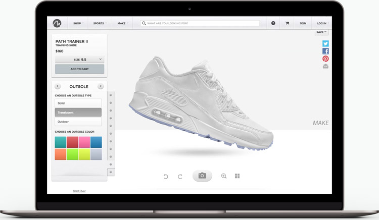
Make's popular sneaker-customizing web app.
My Role
As product designer, my involvement spanned all stages of the design process: research, strategy, design, and user testing. The result is MakeIT, a mobile application that enables users to select, customize, and purchase sneakers from Make.
Tools:
- Google Forms
- Draw.io
- Sketch App
- Adobe Illustrator/ Photoshop
- Invision
- usertesting.com
User Research
In order to gather insight about the target market, I posted a user survey to the Sneakers subreddit ( Link ) and organized a detailed competitor analysis using Xtensio ( Link ).
Users explained that they didn’t feel heard. Performance issues like lost functionality, cluttered UI, and poor payment integration were a frequent problem for users, as well as the shocking inability to actually purchase the product after customization. It was pointed out that companies were more likely to abandon their existing apps before improving them. In the simplest words of one respondent, “they’re clunky.”
Armed with my survey data and user interviews, I created user personas citing the current pains, motivations, and goals of the target market.
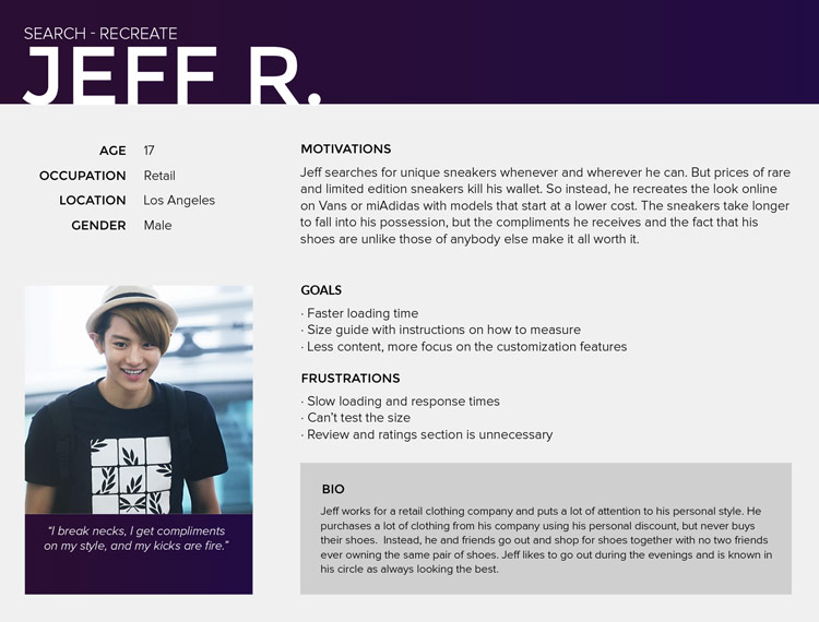
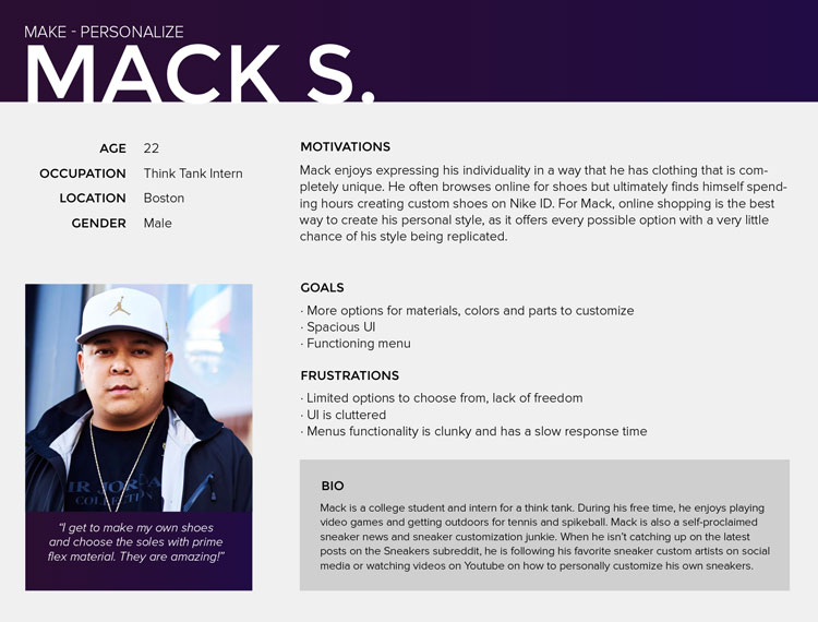
User personas reflecting the data from the research.
The following features would be implemented into the mobile app:
- Social sign-on and login
- Option to customize provided design inspirations
- Large customization screen to view product in real-time
- Options to customize different parts of a shoe using a wide database of materials/ colors
- In-editor Autosave
- Quick-Pay member checkout experience
User Stories & Flows
Based on the motivations in my user personas, I generated a list of user stories to help define the main tasks of two user groups: new and returning users. I then created user flows in Draw.io ( Link ) to break down the complex user stories and visualize the paths of action users take to achieve their goals.
This stage of the design process was critical in identifying the areas of cognitive overload and redundancies. I noticed that I could move the option to customize a pre-designed inspiration to its own screen (or possibly a modal window), creating more room on the editor screen. Also, my checkout experience for returning users could have pre-filled form fields based on saved information from last purchase/ personalization of a user’s profile.
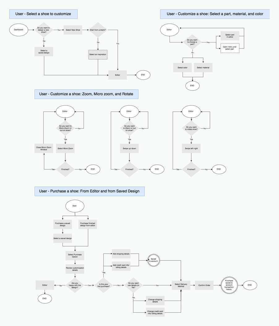
Flows visualizing the primary needs of the user.
Branding
Simultaneously, I began designing the brand identity and visual design systems. As a sub-brand, MakeIT would reflect the values of Make, but with a more adventurous spin.
The MakeIT brand identity adds a personal touch to the Make logotype. The ‘IT’ in the mark references the experience of customizing a model of sneakers and making it your own.
(from top):(from left): Identity mark for parent brand Make; identity mark for MakeIT;
The color system is inspired by the galaxy. Cool purples set the tone, while soft grays and whites reference distant stars in the night sky. I also adopted Make’s signature orange color to help direct attention to important notifications and primary calls-to-action within the app. The use of the color also reinforces the parent company’s brand image.
My type system features Montserrat on the headers for its strong lines and prominent characters for exceptional readability. I use a lighter weight of Proxima Nova in the body to achieve more space between all other elements on screen.
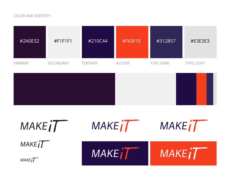
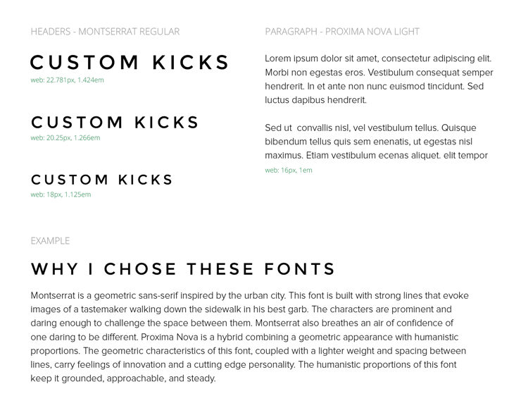
Visual systems (from top):(from left): Color system for MakeIT; type scale for MakeIT;
Wireframes
In creating my wireframes, I focused on reducing confusion of the editor screen, balancing artboard dimensions with respect to readability, visual balance, and touch-friendly UI. To reach these goals, I stripped away extraneous features users were less interested in, like product review and social media share options.
Within the editor screen, I explored ways to minimize the display of customization options in the editor panel to maximize the dimensions of the live-progress window.
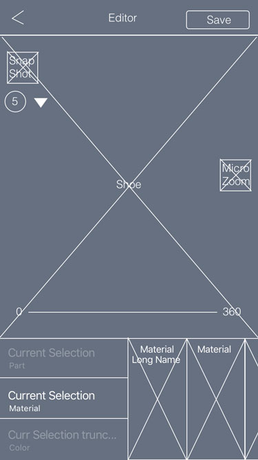
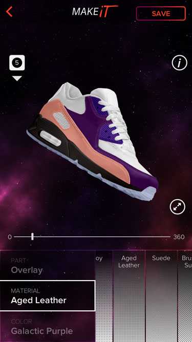
Editor screen (from top):(from left): Lo-fi wireframe; hi-fi mockup;
After meeting all the goals to pixel perfection, I added the interactive and help features to the editor screen, including:
- Snapshots
- 360°-view rotation slider
- Microzoom modal button
- Session auto-save
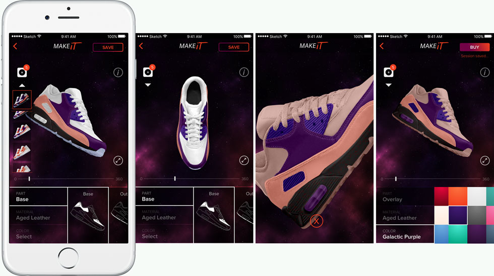
Editor screen features (from left): Snapshots - images revealed, rotational slider, zoom, purchase button
Prototype & User Testing
I created the prototype with Invision ( Link ) and wrote a script for user testing (Link ). The script focused on directing the new and returning users through customization and the purchasing funnel of their finished product.
The results from the first round of user testing showed that users were overwhelmed by the number of features in the editor screen. I noticed that the app was diverging from familiar editing actions of the web app. So I added a first-time user onboard process that highlighted the customization process and key features within the editor.
With the help of additional testing, I was able to condense the onboarding process to five screens with an opt-out button to exit the process at any time and move straight to the editor. Users found this onboarding process to be, in their words, “self-explanatory” and “easy-to-understand.” Most importantly, the addition reduced the confusion and led to more users completing their purchases.
The final five onboarding screens displayed:
- Main editor tools
- Snapshots feature
- Rotate & Zoom features
- Purchase button
- Exit screen and callback icon
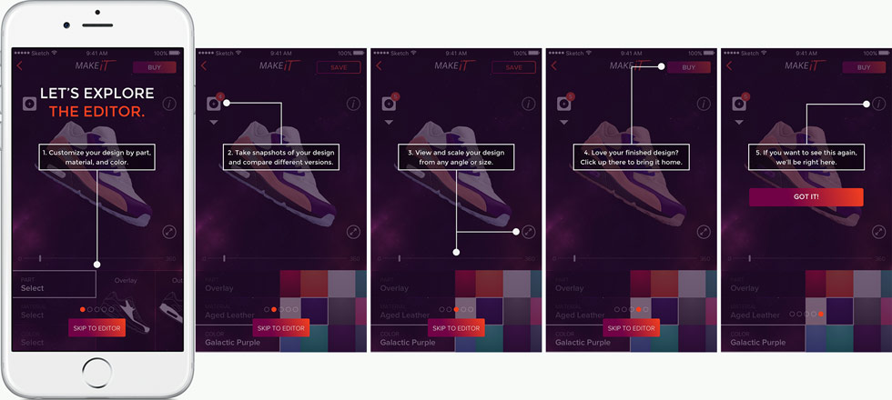
Final screens for the onboarding process.
Reflection
This project taught me to:
- Outline a project roadmap factoring in at least 20 percent additional time. My project roadmap accounted for the minimum but I exceeded that. Incorporating user feedback into wireframes took more time than I’d accounted for, specifically in the manner and stage I conducted my tests. I realized that this pace can affect other teammates and so needs to be scoped accurately and delays acknowledged immediately.
- Test early and test often! I user-tested designs at the hi-fi stage while building my prototype, when I should have saved myself the effort of mockups by testing lo-fi wireframes and prototypes. In an agile project, where the product needs to be pushed to market quickly, missteps like these would create delays and work against the overall budget.
- Review the usability script before sending it into the wild. If it doesn’t make sense, the design could be great, but the user won’t understand what is being asked of them. This happened with my first round of user tests. In the future, I’ll be proofreading my script with others (team members, confidants, Mom, etc.) to find discrepancies.
- If possible, conduct the user test in person. I used usertesting.com for my user tests because it allowed me to instantly test my design through the Invision-Usertesting partnership. However, when users became stumped by a question or confused by the limitations of the unfinished prototype, I was unable to provide them alternative tasks, without skewing results, to salvage the remainder of their test time.
- Discovery is natural. During usability testing, I found out what didn’t work. But I also noticed how users navigated through the app. Designers need to take these risks when designing key features. I learned to explain these unfamiliar design features in a manner that is simplistic and unobtrusive to overall experience and always include a back/ exit action.
READ ANOTHER CASE STUDY


people are possibly viewing my portfolio now!