Back To Contents
[Rise & Shine Cold Brew]
A subscription delivery service for Cold Brew coffee enthusiasts.
Rise & Shine is an independent, homegrown coffee company that produces and distributes Cold Brew coffee to restaurants and cafes in the Condesa neighborhood of Mexico City. The company wants to expand into the consumer market by starting a delivery subscription service. The client’s goal is to get their customers to sign up and subscribe to their service online.
The Problem
My challenge was to develop an understanding of the attitudes and motivations of coffee enthusiasts and addicts alike in order to create a responsive subscription-based e-commerce website for the brand.
My Role
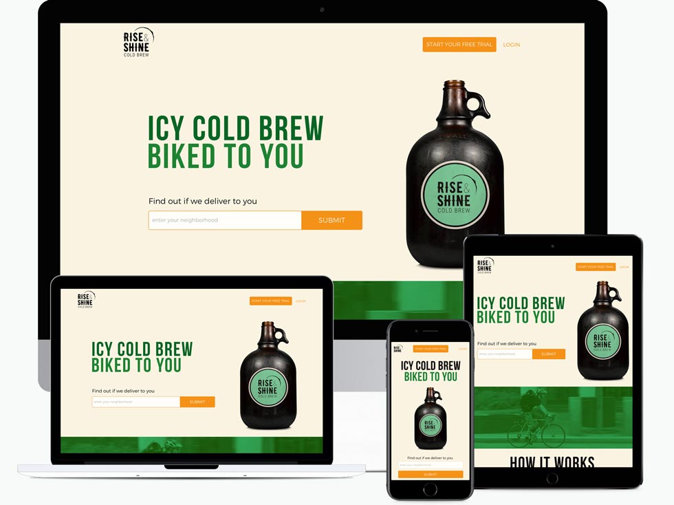
As product designer, my involvement spanned all stages of the design process: research, strategy, design, and user testing. The result is a responsive customer-facing website.
Tools:
- Google Forms
- Draw.io
- Sketch App
- Adobe Illustrator/ Photoshop
- Invision
- usabilityhub.com
- usertesting.com
User Research
In order to gather insight about the target market, I created a survey in Google Forms utilizing the conditional logic feature and posted it to the coffee ( Link ) and Cold Brew subreddits ( Link ). I also sat in various third-wave coffee shops around the Condesa and Roma neighborhoods and made conversation with neighbors seated next to me, particularly those I noticed ordering a Cold Brew.
Through my research, I sought to learn potential customers’:
- Coffee-drinking habits
- Online-purchasing habits of coffee drinkers
- Needs for a subscription delivery service
- Approach to using a subscription delivery service
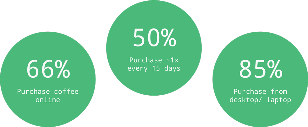
Some of the data pulled from user research.
From the surveys, I learned that more than half the respondents had tried and enjoyed Cold Brew coffee. Also, respondents purchased their coffee online because it saved them time and money and helped them jump-start their morning routine.
Shoppers who purchased coffee products online expressed a need for a quick way to reorder their most recent/ favorite product(s). Shoppers also felt that more in-depth product descriptions could help them make better purchasing decisions. The majority of shoppers shied away from purchasing coffee from mobile devices. With some digging, responses centered around complex and confusing order and checkout processes.
Due mainly to the lack of education on the benefits of Cold Brew over a normal cup of drip coffee, most survey respondents were averse to ordering Cold Brew coffee online. In my interviews, I shared the benefits of Cold Brew coffee (i.e. long shelf life, lower acidity) and observed that 80% expressed a heightened curiosity and interest in trying out this subscription delivery service.
What I found most surprising was that Cold Brew coffee was enjoyed by a wide range of coffee drinkers and, more surprisingly, by an older demographic. My initial thoughts were that Cold Brew was a trendier way of drinking coffee and that an older demographic would rather stick to their main drink. But coffee drinkers were keen on trying most coffee products at least once, particularly as those products came closer to the natural flavors of the coffee bean.
Based on my research, I created two personas: The Newbie (visitors/ potential users) and The Loyalist (returning users). I created a business admin persona. But this deviated from the scope of the project. I later referenced this persona to help create the brand story of the company.

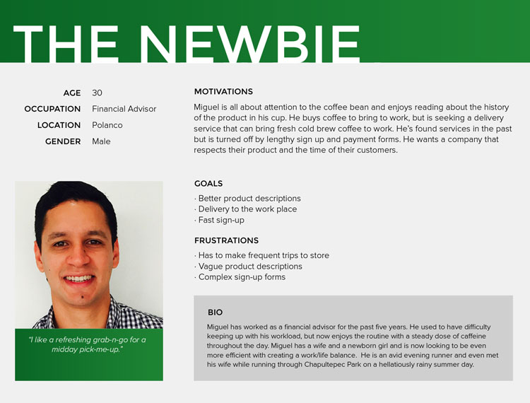
Personas (from top):(from left): The Loyalist represents returning users; The Newbie represents potential users;
I also analyzed Almanegra Cafe, Dosis Cafe, and Buna 42 - competitors in Mexico City’s trendier, coffee-drinking neighborhoods, taking account of their strengths/ weaknesses and how they were fulfilling the needs of the target market.

Analysis of three competitors that serve/ deliver Cold Brew. (from left): Cafe Almanegra, Dosis Cafe, Buna 42.
These competitors challenged Rise & Shine in the retail sector, but they would almost certainly lose their advantage online and in the e-commerce sector. The competitors weren’t recognizing the mobile audience. Furthermore, their websites existed merely as marketing pages. The sites were unresponsive, forms weren’t optimized for mobile accessibility, and content/ blogs were outdated. The checkout experience, if it existed at all, was confusing to fill out. Most pushed for social engagement by directing users towards to connect with their social media pages.
Two of three competitors mentioned on their sites that they sold Cold Brew coffee. However, there was little attention put towards marketing their Cold Brew coffee, their Cold Brew subscription service, and they fell short of effectively highlighting any products they offered as a signature or specialty of their brand.
I saw a huge opportunity to quickly and effectively grow a loyal following, build capital through online sales, and gain ground in the coffee race.
After organizing the data, I concluded that Rise & Shine’s online subscription service would need to be responsive in its design, highly informative of the product(s) it is offering, and simplistic in its order and payment processes.
The following features would be implemented into the product:
- Delivery Service Validation (by neighborhood, zip code, etc)
- Subscription Management
- Simplified order and payment forms
- Personalized delivery service - Product, Time, Location
- Account creation
User Stories & Flows
I generated a list of user stories based on the personas and created user flows ( Link ) to help define the main tasks of The Newbie and The Loyalist.
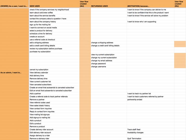
Use case stories of potential and returning users.
I focused on moving new users to the product page of the site. Following service validation, new users were split into two groups: 1. users who lived within the service area and 2. users who lived outside the service area. Users within the service area validated and moved swiftly to the product catalog page to begin the order process. Users outside the service area were treated like the former but with additional options to contact and connect with the brand. By continuing the flow for this user, I could increase user engagement and generate a lead for the brand.
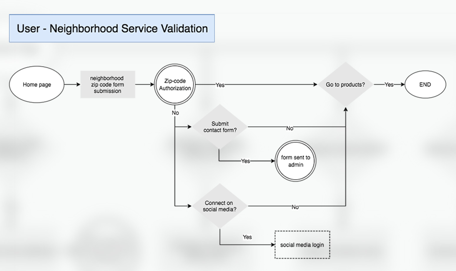
User flow to determine if the brand can delivers to the neighborhood submitted.
To outline the user flow of the signup process, I referenced the design solution of Stumptown Roasters, an indirect competitor based out of Portland and distributing their products throughout the US. This company designed for engagement by allowing users to first create their order. Upon submission, the user is prompted to log in/ sign up to continue their order. This is a great conversion strategy because the user has already decided to invest in the product.
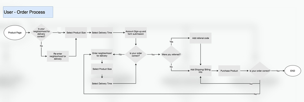
User flow of the order process and checkout funnel.
Branding
Simultaneously, I began designing the brand identity and visual design systems.
The logo incorporates two fonts juxtaposed in balance and harmony. The words ‘Rise’ and ‘Shine’ are represented with a rugged and handwritten decoration, similar to many of the storefront signs of Mexican tiendas. The ‘&’ and ‘Coldbrew Coffee’ are sharp and clean, models of a modern, exemplary brand. The logo is held together by the sunshine rising from the right corner of the type, its undulated edges referencing the stain left behind by the bottom of a coffee mug.
(from top):(from left): Identity mark on white/ light backgrounds; Alternate mark on dark backgrounds;
The color system is inspired by the hills of Mexico’s Oaxaca region. The colors are warm, organic, and hint of a product grown close to home and with great care.
My type system uses Bebas Neue for headlines and Montserrat for body content. Bebas Neue captures the bold spirit of the brand while Montserrat reflects its modern approach over a widespread audience.
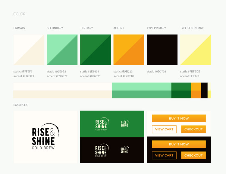
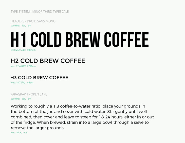
Visual systems (from top):(from left): Color palette, type scale.
I also created media to enhance the display and strengthen the story being told. Like the logo, the graphics were inspired by handpainted signs. They are spirited and evoke feelings of a homegrown, independent brand. The graphics are finished with an overprint treatment that represents all the hands that go into the making of the product.
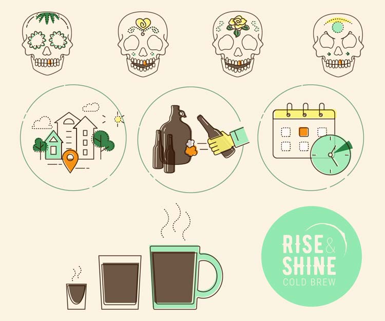
Custom-made graphics to reinforce the brand story.
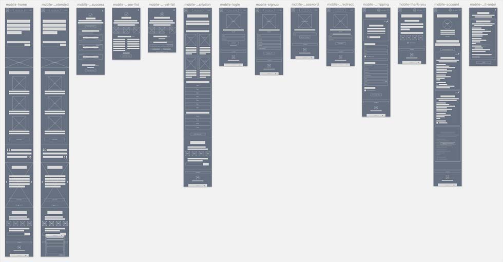
Wireframes
I needed to accommodate for mobile users in the design and decided for a mobile-first design approach. The limited real estate on the mobile screen forced me to prioritize the layout of content. It also forced me to stay honest with user needs and include only the content necessary to reach user goals.

(from top): Lo-fi mobile wireframes; Hi-fi mobile mockup of the homepage.
To help the user navigate the site, I grouped content into sections with bold headers and comfortable spacing. I told the brand story through an image slider. The slider could be navigated manually and a dot indicator was used to show the number of slides. A call-to-action button was added to each slide to direct the user through the site.
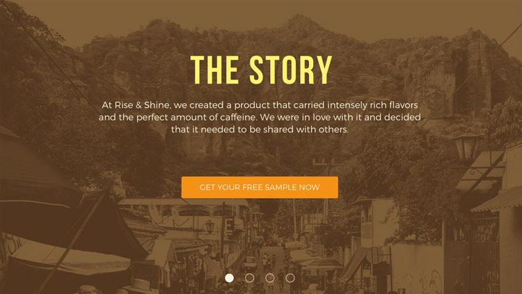
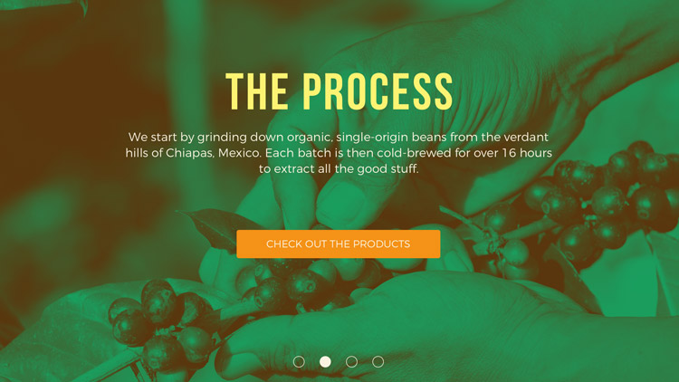
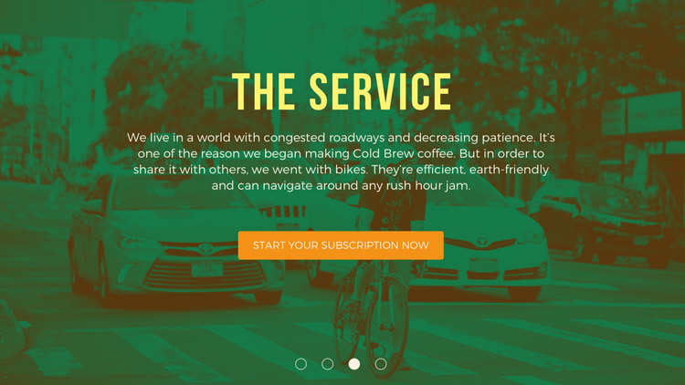
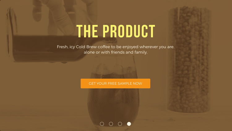
Slides for the carousel (from top): The Story, The Process, The Service, and The Product.(clockwise from top-left): The Story, The Process, The Product, and The Service.
I also focused on the visualization of the service validation flow of new users. The validation feedback was designed as a full-screen modal with actionable steps that continued the user experience. Full-screen modals would be a continuing design pattern throughout the site for users to easily digest information.
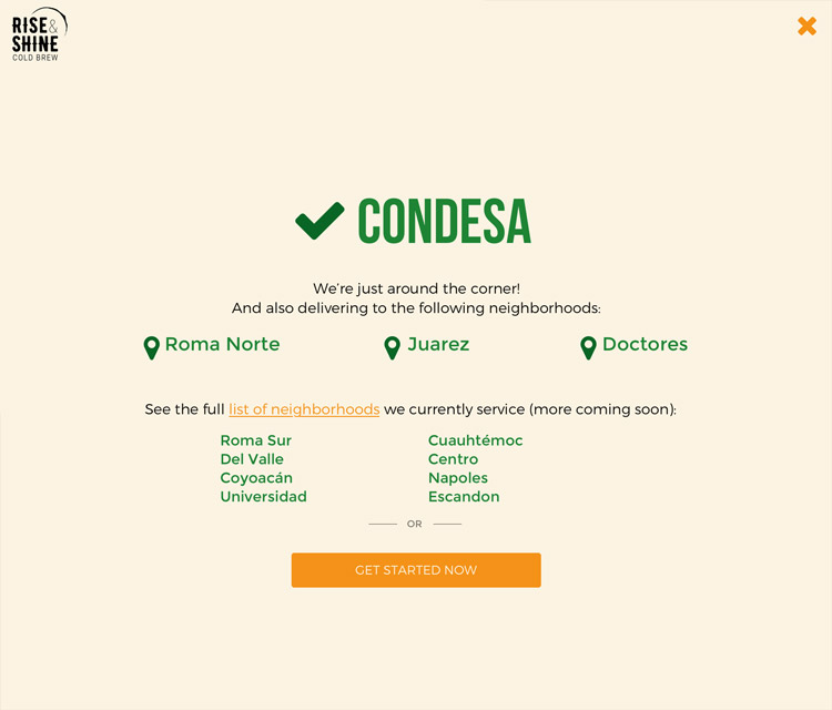

Feedback screens for neighborhood service availability (from top):(from left): Service available, service unavailable.
Another area I focused on was the member account/ subscriptions page. From a business standpoint, satisfied customers would set up additional subscriptions for family/ friends. So rather than approaching this page as an area to manage-cancel subscriptions, it would be designed to manage-add subscriptions. Initially, I added an ‘add subscription’ call-to-action button above the subscriptions. But viewed from a mobile device, multiple subscriptions would force the user to scroll this CTA from the screen. Rather than reducing the screen space with a sticky CTA, I added an additional CTA button below the full list of subscriptions to subtly reinforce this action.
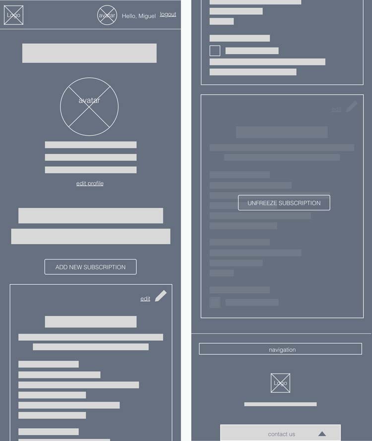

User subscription managment screen (from top):(from left): Lo-fi wireframe, hi-fi mockup.
One challenge to the checkout process was reducing hesitance. I designed the checkout page with a sectioned form so the user could review their order and input payment details on one screen, reducing frustration that comes from navigating multiple forms and pages. With an intention for higher conversion, I used checkboxes to minimize form fields, providing users with a view of an optimized, lightweight form.

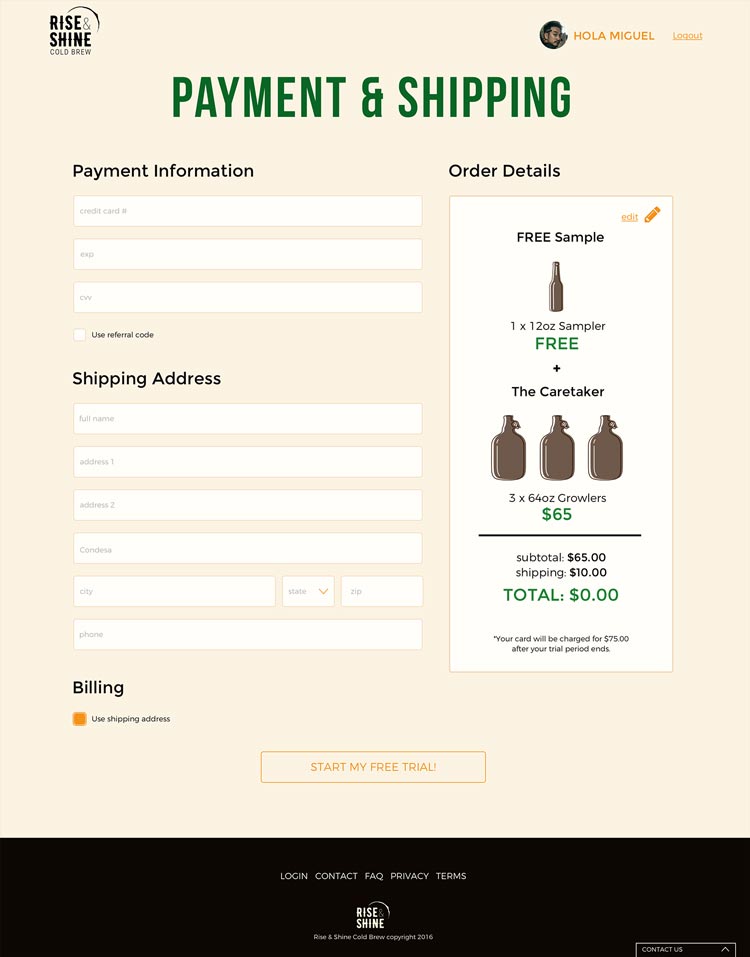
Payment information screen (from top):(from left): Mobile view, desktop view.
In my first round of testing, multiple users raised concerns regarding the details of the free trial agreement. Users didn't understand the how the free trial worked because my first designs did not include this information. I had relied on an assumption that the user would enjoy the appearance of the free sample added to their order on the checkout page. I saw this as an issue of transparency and prioritized getting these details on the product catalog page for the next iteration, to be read and understood by the user before they began creating their order. Adding this disclaimer at the beginning of the product catalog page built up user confidence to work through the order funnel.
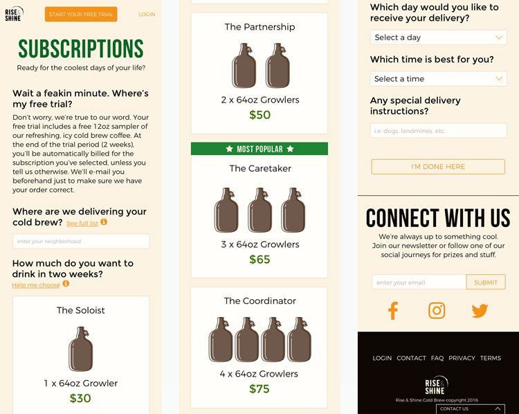
Product catalog screen, mobile view.
On the product catalog page, users also communicated the need to view the neighborhood list and for a better understanding of how much to order. For the next iteration, I added two contextual help screens that could be accessed by clicking/ hovering over the help link next to the relevant section of the product form. The first one showed the full list of serviceable neighborhoods and the other provided a visual aid of the caffeine levels of Rise & Shine’s products compared to other types of coffee drinks.
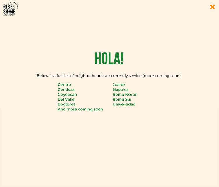

Contextual help screens (from top):(from left): Full list of serviceable neighborhoods, visual aid of caffeine levels.
In the subscription-management page, users commented on my use of the color orange as visually exhausting . In an attempt to highlight actionable areas, many of the elements had been given an orange treatment. This de-emphasized primary actions from secondary actions and other. So I conducted a preference test of the page exploring alternative button treatments. The test resulted in two additional button styles that helped to alleviate confusion and re-emphasize the primary actions.

Final CTA button styles.
Reflection
This project taught me to:
- Understand the product, then write the copy. Writing copy became easier after speaking with the industry professional about his own business. I treated our phone call as an interview with a key stakeholder and asked all the questions necessary to get an understanding of the industry, his business, and the products he sold. His words and insight were used to create a persona that later helped me create a better brand experience.
- Utilize preference tests. These short tests helped me decide which actionable phrases to add to my call-to-action buttons, phrases that could ultimately lead to higher conversion rates.
- Provide clear hierarchy of content in lo-fi wireframes. I discovered users had a difficult time distinguishing a headline from body copy and a button from a link. I recognized this could pose an issue on larger teams where the person that created the wireframes is not the person explaining those same wireframes to others involved on the project.
- Reduce confusion for the user, then help them make a decision. Removing redundancies within a product’s design makes it easier for users to understand the interface… or the form they’re requested to fill out. But I learned that the design could be made even more intuitive by helping users make decisions. Helping, and influencing, user decisions could be as simple as 1. highlighting the popular item within the product group to help lead the user to signup up or 2. pre-selecting form fields to expedite form completion.
Moving forward, I’m already thinking of how to present extended delivery coverage. With more neighborhoods serviced, the list could grow cumbersome and TL;DR. I’m also considering the IA arrangement of new or seasonal products on the landing and product catalog page. Lastly, I would put more attention on The Partner, a business/ shop owner who’d receive benefits from the brand for referring customers. Taking another step back, this project could also dive deeper into the user interface of The Admin, the third persona created for personal reference. There are many parts to this passion project, but it goes nowhere without first solving the problems for the primary users.
READ ANOTHER CASE STUDY


people are possibly viewing my portfolio now!