Back To Contents
[Waitless]
A mobile order and payment app for people who love drinking, but hate waiting.
Many people enjoy the nightlife. But often, the unenjoyable parts are waiting in line at the bar or splitting the tab — highly inefficient processes that often include being elbowed, getting doused with a spilled drink, being ignored by the bartender, or waiting while staff locates the misplaced payment.
Waitless is a mobile app development company based in Los Angeles, CA, led by a team bent on shaking up the pay-at-table and bar-tab mobile app categories. The company’s latest idea is a mobile and watch app for patrons visiting bars and venues that garner large crowds and long lines. The solution removes the user from the lines, gives them more control over order and payment, and ultimately makes the occasion more fun and enjoyable.
The Problem
My challenge was to understand the target market of users who have used mobile order and payment apps, analyze the competitive landscape of these app categories, and design a product that shared the experience between mobile device and wearable.
My Role
As product designer, my involvement spanned all stages of the design process: research, strategy, design, and user testing. The result is the company’s first iOS mobile app with Apple watch compatibility.
Tools:
- Google Forms
- Draw.io
- Sketch App
- Adobe Illustrator/ Photoshop
- Invision
- usabilityhub.com
- usertesting.com
User Research
I determined my target market by sending a survey screener across social media, interviewing a select few about their venue experiences, and gleaning mobile payment insight from the following sources:
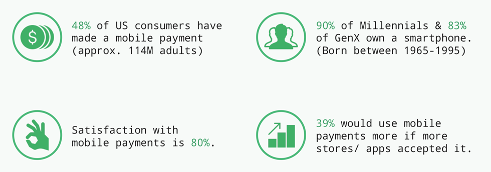
Data gleaned from mobile payment reports.
My interviews revealed that respondents wanted quick access to venues and their order menus. Users were frustrated with apps built with too many extra features. Feature bloat created mental havoc for the user and pulled the focus away from these primary user needs.
Users wanted a simpler way to select drinks and submit their order. Respondents had trouble reading through lengthy drink menus. Small buttons and text made it difficult to add drinks and review the order before submission and brightly-backlit screens were harsh on the eyes.
Users also wanted better explanation and flexibility in how they could split bills with friends in a group. Splitting a bill was a primary feature of competitor apps, but the process confused the user or the app didn’t offer an option to split the bill by line item (Velocity app).
I organized my data by creating personas that I could refer back to throughout the design process ensuring that I was designing for essential user needs and goals and to reduce the risk of feature bloat in my products.
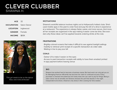
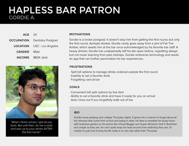
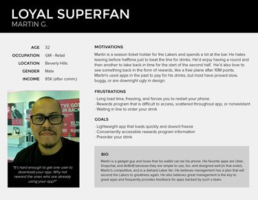
User personas reflecting the data from the research.
In addition to user research, I created a competitor analysis ( Link ) of the following apps: Tabbed Out, Velocity, and Orderella. Tabbed Out highlighted user incentives through their loyalty/ rewards program, but the UI was inconsistent — color of the menu bar and use of the color blue, requiring the user to learn new representations for tasks. Orderella suffered from similar inconsistencies. However, it utilized an onboarding experience to explain its key features, answering popular questions and increasing confidence of a potential user. Velocity had the most appealing and delightful design. But it also had the most feature bloat of the three competitors and limited itself to four- and five-star venues that were “hard-to-reserve.”
I decided to strip out the best features from each app that would solve the needs of my users and incorporate them into my product designs.
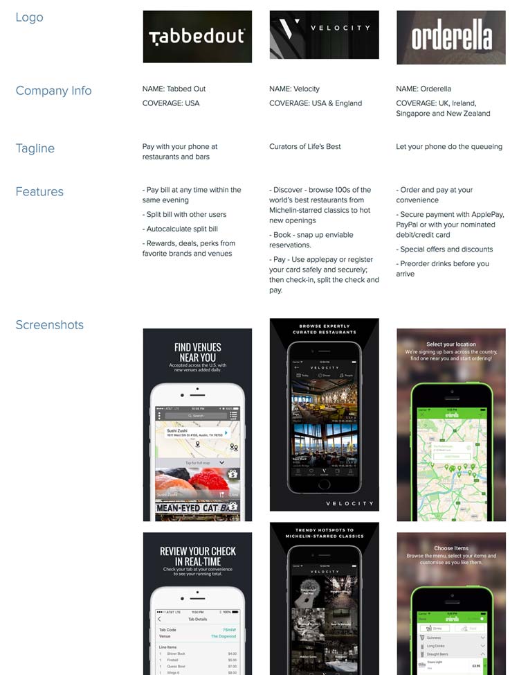
Analysis of three competitors in the pay-at-table and bar-tab mobile app categories. (from left): Tabbed Out, Velocity, Orderella.
After poring through all the data, I concluded that the products would be designed with the following features:
- The ability to search for nearby venues
- Discovery by geolocation - nearby participating establishments
- Drink pre-order notification based on menus of participating establishments
- In-app checkout
- Real-time order tracking
- Split-tab calculator
- Auto-closeout based on geolocation
- Auto-applied promo codes
- Tip preset for minimum gratuities
- Preferred-drink preset
- Discount/ Perks/ Rewards (DPR)
User Stories & Flows
I generated a list of user stories ( Link ) and user flows ( Link ) to help define and prioritize the actions of the user. The user stories helped me determine the minimum viable product essentials to design for, the specific features applicable to the watch app, and the nice-to-haves that held less importance.
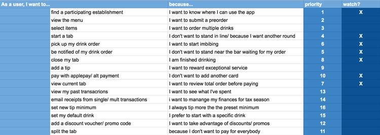
Use case stories helped determine watch app features.
In my user flows, I recognized areas where the flows could be simplified through automation. Automating secondary actions would provide a more delightful and seamless experience for the user. Areas benefiting from automation included the promo-discount application and default tip amount in the User-closeout flow.
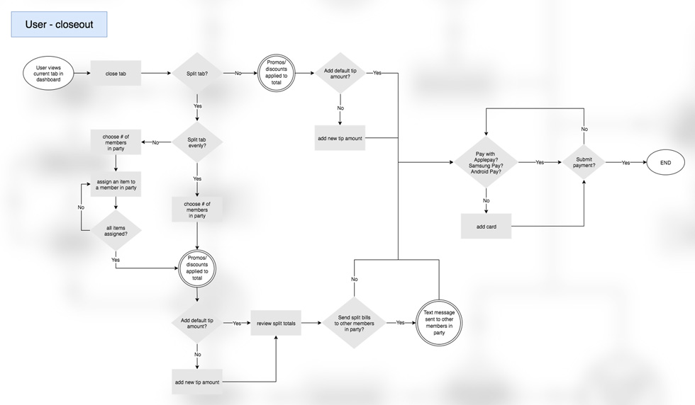
User flow of the closeout payment funnel.
I also focused on the order process and pulled inspiration from the order review screen of the Starbucks app, a drink order app mentioned by more than one survey respondent. In addition to reviewing the full order after adding a drink, users would have the ability to edit or remove a drink before submitting their order. This flow would remove complexity from the menu screen and allow the user to focus on submitting the correct drink order.
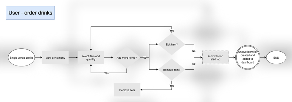
User flow of the drink order and submission process.
Branding
Simultaneously, I began designing the brand identity and visual design systems.
The logo is built up using three visual concepts representing the following brand attributes: Personal, time sensitive, and effortless. The result is a strong, balanced mark that is recognizable at any size.
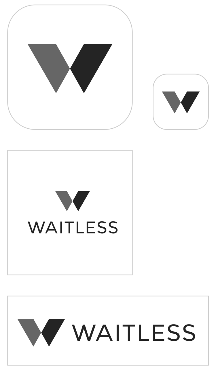
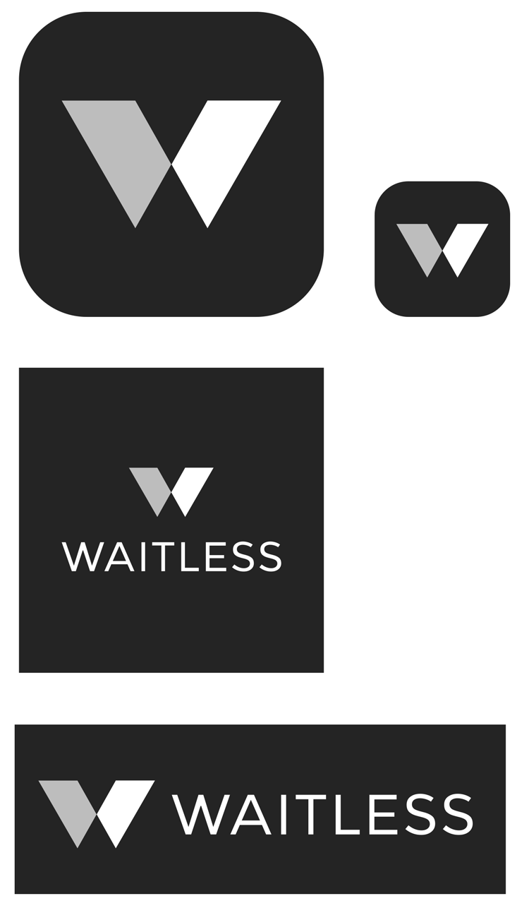
(from top):(from left): Identity mark on white/ light backgrounds; Alternate mark on dark backgrounds;
The color system is fresh, inviting, and lively. The palette is inspired by the idea of a group of young professionals enjoying a Santa Monica night out.
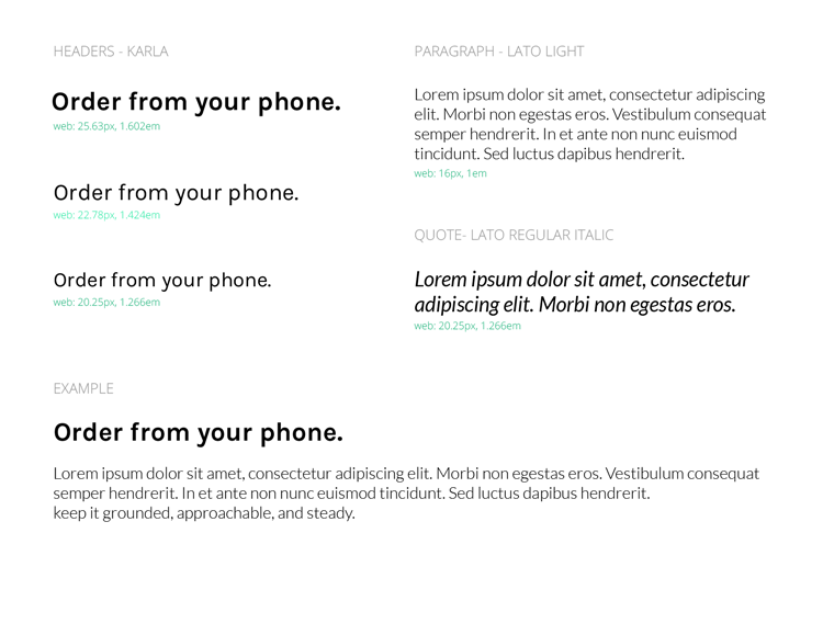
My type system uses Karla for headlines and Lato for body content. Karla has a quirky professionalism, a duality that resembles the modern spirit of the working world. Lato is modern and its light weight makes it easier for the user to navigate through a venue’s drink menu.
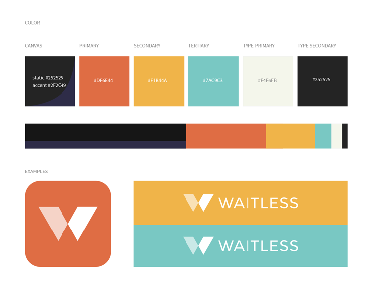
Visual systems (from top):(from left): Color palette, type scale.
Wireframes & User Testing
I designed my closeout process to be short and sweet. Users had the option to pay the bill or split it two different ways. They could add profiles of others who also used the app or claim unassigned drinks to their portion of the tab.
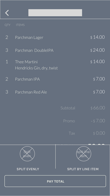

Closeout review screen (from top):(from left): Lo-fi wireframe, hi-fi mockup.
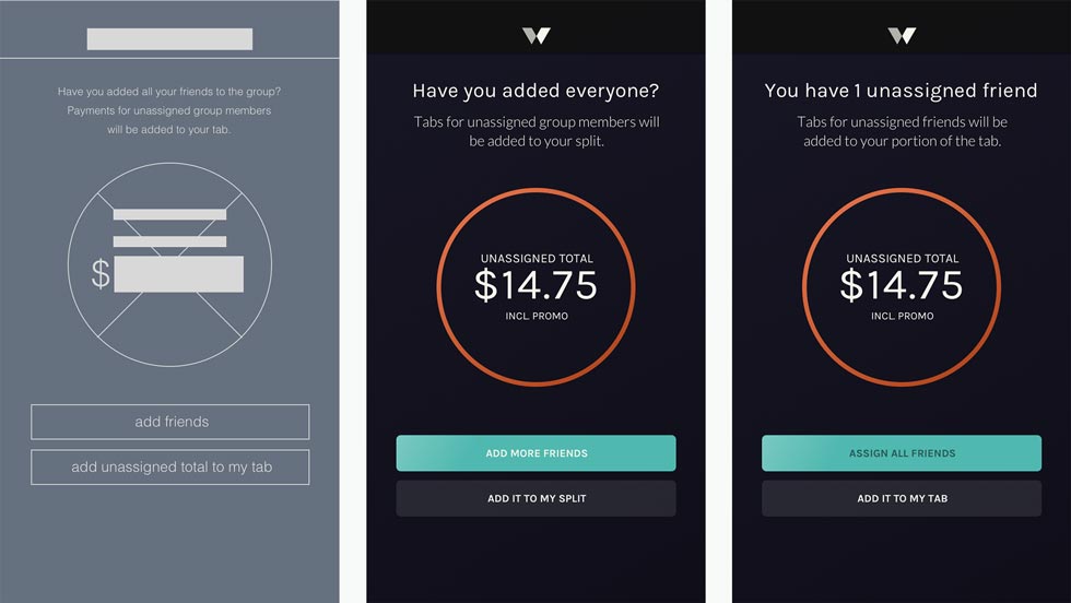
I conducted a user test on my lo-fi wireframes and received invaluable feedback in areas of the process that I had blindly overlooked. Users, particularly those with Android devices, disliked my current labeling system for unassigned friends and informed me how that system was typically reserved for message notifications. My solution was to remove this system and replace the avatar placeholder icon with one that was more semantic.
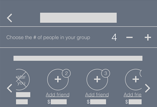
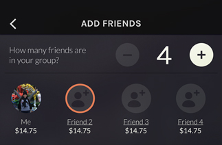
Iterations of the labeling system for unassigned friend profiles (from top):(from left): Lo-fi wireframe, hi-fi mockup (original), hi-fi mockup (final iteration).
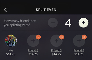
Users also highlighted redundancies within the split process. My initial screens carried over the tab review section from the first screen. My final solution replaced the tab review with the contact list to put emphasis on assigning profiles. This shortened the process by a few clicks and resulted in faster task completion of assigning profiles to members of the group.
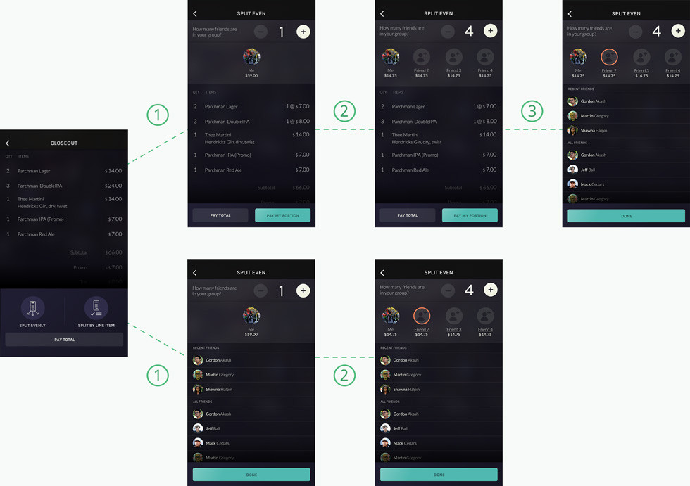
Payment process (split by line item): Original flow (top), final iteration (bottom).
For the venues, I leveraged Usability Hub’s Preference Test feature and tested card content layouts to help me finalize a solution. Users appreciated the larger image because they could ‘see’ the venue. I took this feedback and made the image a focal point of the cards in my list view.
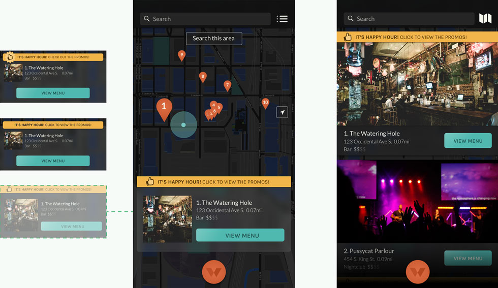
(from left): card content layouts, discovery screen (map view) with preferred card design, discovery screen (list view).
I also explored the presentation of menu item options focusing on space and button size. I reduced the opacity of option buttons to direct the user’s attention towards adding the drink to the order. Button sizes were increased for users to scan, understand, and take action.
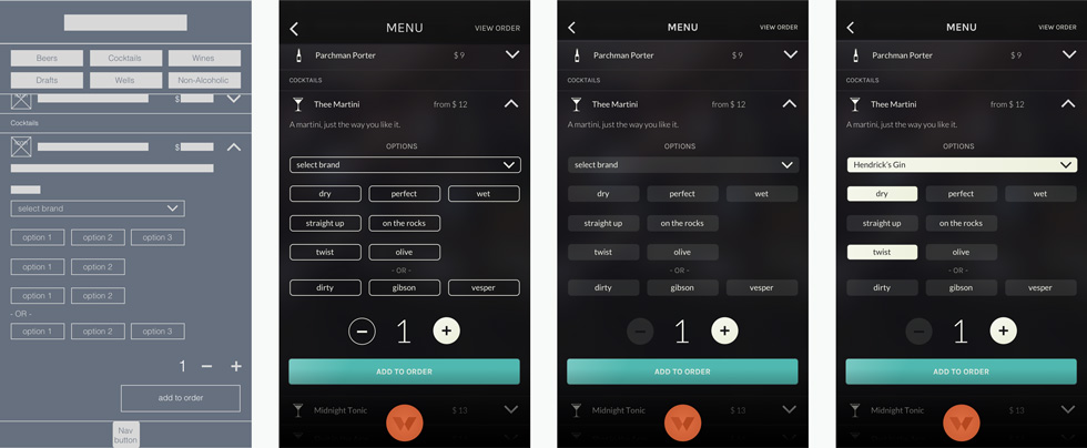
Single menu item expanded to display options (from left): lo-fi wireframe, hi-fi mockup (original), hi-fi mockup (final iteration), hi-fi-mockup (final iteration) with options selected.
I adhered to Apple’s Human Interface Guidelines and principles to design the watch app. I also conducted user interviews of Apple watch users to get an understanding of how they used the watch. Watch users utilized their wearable most frequently for notifications and quick access to data. I used this information to create the following screens:
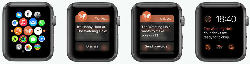

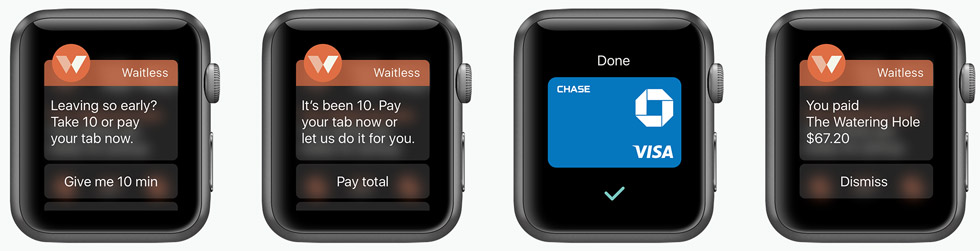
Hi-fi mockups of the Apple Watch app features.
A benefit of engaging users early and often was that I was able to tease out most of the issues and confusions before testing the prototype. However, this round of user testing uncovered issues concerning the copy, particularly within notification messages and CTAs in the closeout screens. During and after tests, users suggested alternative words and phrases that would better help them understand what was being asked of them. I received satisfactory test results after incorporating these changes.
Closeout notification screen alerting user of unassigned friends. (from left): lo-fi wireframe, hi-fi mockup (original), hi-fi mockup (final iteration).
Reflection
This project taught me to:
- Build a list of terms and determine usage. I’m getting better at copywriting with every project, but in this project, I was confusing users by using several forms of ‘bill’ and ‘friends’ freely throughout the app. Terms like these should be defined earlier in a project to reduce confusion in later stages and in testing.
- Save some suggestions for future releases. Users will always have ideas for additional features. At times, I found myself exploring ways to incorporate these nice-to-have features and losing sight of the project goals. If I hadn't established goals at earlier stages of the project, I wouldn't have them to reference back to and could easily have been designing forever. Instead, I learned that it’s better to keep the product lightweight, get something out there, and work these nice-to-have features into a future release.
- Treat the users as the experts. During tests, users brought up some interesting scenarios I hadn’t yet thought of (ex. What happens if I want to create additional orders before I’ve received my first order?). I didn’t have an answer. So I asked the user what they thought would happen and they provided an amazing solution. “Two orders max at any time.”
- Request feedback for future development. I was thinking of the nice-to-have features and wondered if I might be missing other ‘essential’ features that could be first added into future designs. I learned that the best apps don’t leave this to chance and will add a screen to the end of transactions to ask for feedback. By doing this, the brand is better prepared to continue prioritizing feature lists to give users what they want, when they want.
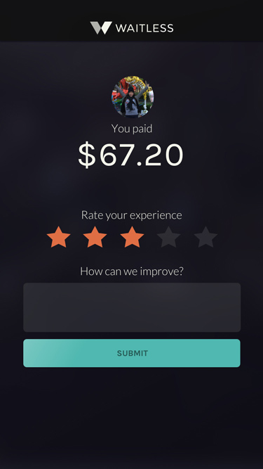
Customer feedback screen. So what'd you think?
READ ANOTHER CASE STUDY

people are possibly viewing my portfolio now!